Data Visualization: Storytelling with Data
What is meant by data visualization?
Data visualization refers to the presentation of data in a pictorial or graphical format. It simply means using data to tell a story. The human brain is designed to absorb information more quickly in a visual format. Charts and graphs make it easier to understand complex data, to detect patterns and to uncover trends.
The modern history of data visualization stretches back to the 15th century when a Flemish astronomer devised the first line graph to represent statistical data. With the emergence of “Big Data”, huge and complex datasets, data visualization has become an indispensable tool or technique for analysis and presentation.
What are the benefits of data visualization?
Data Visualization is the quickest and most effective way to convey complex information. For businesses, it can help synthesize vast quantities of information to drive decision making. Big data is making data visualization increasingly more important. As companies begin to adopt machine-learning to capture even more data – it is becoming more difficult to understand and analyze this data. Visualization allows business owners and other stakeholders a way to uncover, understand and present insights unearthed from data.
The right data has to be captured, prepared and presented in an easily understandable way, or we risk data distortion and the inability to derive valid insights. The right data visualization summarizes and organizes the relevant data in a way that enables the reader to focus on the key messages being communicated. The main advantages of good data visualization include:
- Improved analysis – by allowing comparison and examination of data from different domains at once such as sales, marketing, production
- Recognizing patterns and trends
- Identifying errors and gaps
- Capturing audience or reader interest and engagement
- Communicating a clear message
- Driving decision making
What are the types of data visualization?
There are many types of data visualization ranging from the simple line graphs to complex 3D maps. The most basic and familiar types of data visualizations are bar charts and pie charts. But there are many ways to slice, dice and serve up data visually. Here are four of the most common types of data visualizations:
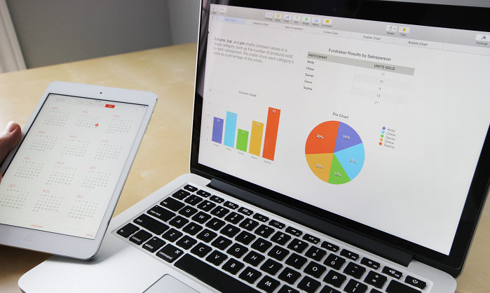
1. Line Graph or Line Chart
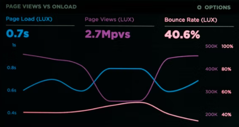
Information is displayed as a series of data points “markers” connected by straight line segments. Often used to show trend data or to compare two data sets. Area graphs are a related type, where coloured areas show the development of variables over time. Line charts can be plotted to show changes of a variable over time – for example revenue/revenue growth.
2. Bar Chart or Column Chart

Variables are presented by columns or bars arranged on the X or Y axis. The height or length of the bar is proportional to the value it represents. Variations of this type of chart include stacked bar graphs, 100% bar stacked graphs, box plots and waterfall charts.
3. Pie Chart or Donut chart
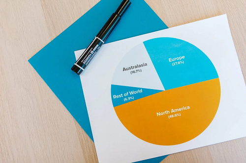
Circular graph divided into slices. The size of each slice represents its proportion to the whole. One type of pie chart is the donut chart – a pie chart with a hole in the centre. Pie charts are best used to depict pieces of a whole – for example market share representation.
4. Scatter Plot
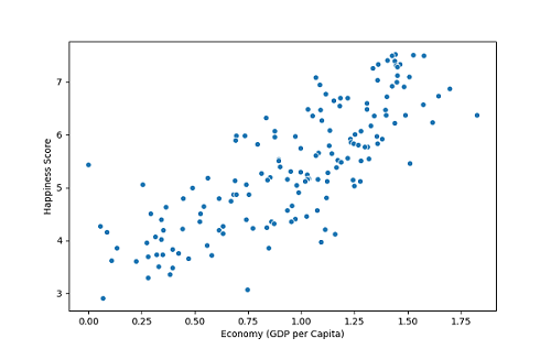
Scatter plots use multiple data points that are plotted on two axes to demonstrate the relationship between the variables.
Aside from these four, below are some other ways data is presented visually.
| Highlight Table | Polar Area | Streamgraph | Word Cloud |
| Histogram | Radial Tree | Text Tables | Cone Graph |
| Matrix | Area Chart | Timeline | Pyramid Graph |
| Network | Tree Map | Wedge Stack Graph | Funnel Graph |
How to create the best data visualizations?
The best data visualizations don’t start with data. They start with questions. Data is meaningless without context. Before choosing a data visualization type, you should pose these questions:
- Who is the audience for this data visualization? What is the purpose of the data?
- What questions or concerns are being raised?
- What answers are being provided by this data visualization?
- What message is being communicated?
- What other issues or questions will be raised by the data visualization?
Once these parameters are established, you need to move to data selection.
Display the relevant data and only the relevant data
- Data visualization tools can make it easy to add all sorts of information to your visual.
- Ensure that the data is represented accurately – by checking axes or spacing
Select the most effective visual for the data
- Different data sets are best represented by different types of graphs or charts. For instance, line graphs depict time series most effectively, while scatter plots can show the relationship between two variables.
- Choosing the wrong type of visual can confuse the reader or audience by misdirecting attention – for instance using a pie chart to represent changes over time
- Visualise one aspect per chart so that you focus the attention of the readers and do not distract them by cramming too many parameters.
Apply sound data visualization design principles
- Cut down on clutter. Any design element that does not add to the message detracts from it, such as unnecessary labels or grid lines.
- Use text and labels to clarify what is being shown.
- Use colour to highlight, differentiate or compare – not to distract.
- Use the same colour for the same data category.
- Use colours that complement each other and do not distract from the data.
- When using dashboards, ensure that you are presenting the right objective.
Storytelling through Data Visualizations
Great stories come from great data. Data on its own does not have value. It must be organized into a coherent narrative. Data visualization goes far beyond just presenting data – it allows us to “interact” with the data – providing the opportunity for more impactful analysis. Clear visualizations make complex data easier to grasp, that makes them valuable in many contexts where decisions need to be taken.
Microsoft Excel remains a popular data visualization tool, but there are many other applications that provide more features. We’ve described some of the best data visualization tools here.
There are many distinct factors that go into developing the most impactful visualizations. When you are beginning your data viz journey, it can be especially useful to go to the experts. Pangaea X has top-tier data professionals experienced with the best data viz tools. You can find more info. here.


Get your data results fast and accelerate your business performance with the insights you need today.