Journey of a storyteller

Every organisation has its unique way of telling its story. It is crucial to have a story teller in your team. Data Viz is a popular way of representing the numbers, facts and figures of the organization which enables management to make some very important decisions for the business.
Today, we have a lot of people transitioning their career into becoming experts in data visualisation tools like Tableau, Power BI, Looker, Datorama, Domo etc. Having the perfect blend of graphs, slice and dice features, filters and colour palettes helps any user- even management, it gives a clear indication of what is happening in their business. In the data world, this is called descriptive analytics.
How do you learn storytelling with data?
To start with, by understanding the basics of data jargons.
1. “Data is the new oil”-Clive Humby
Today’s businesses have massive volume of data that continue to grow.
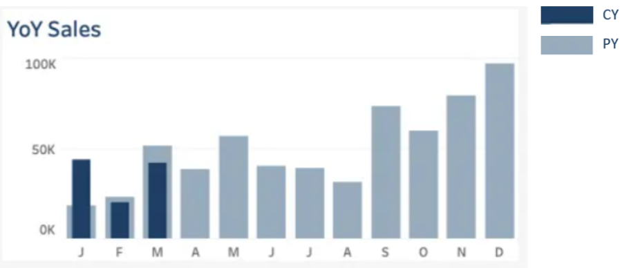
Every business has questions! A good data visualisation is one which gives you a clear picture of the answer you are looking for. For example, what is the current YTD sales compared to Previous YTD sales.
The below snippet clearly shows that January performance in the current year has been much better than the previous year.
2. “Data will talk to you if you are willing to listen to it”- Jim Bergeson
Look for patterns and trends in your raw data. Inspecting the data carefully to understand the business goals to give you an outlook on your next steps.
3. “Without a systematic way to start and keep data clean, bad data will happen.” — Donato Diorio
The data which is provided to you can be chaotic. A cleanse of this data is essential and it is usually one of the most important step as the data has to be clean for the right numbers to reflect. Let’s say, you are using tableau. Tableau is a market leader in data visualisation and provides the user with basic cleaning up functionalities through Tableau prep. Don’t worry! Its not rocket science and very easy to learn.
4. “Data really powers everything that we do.” – Jeff Weiner
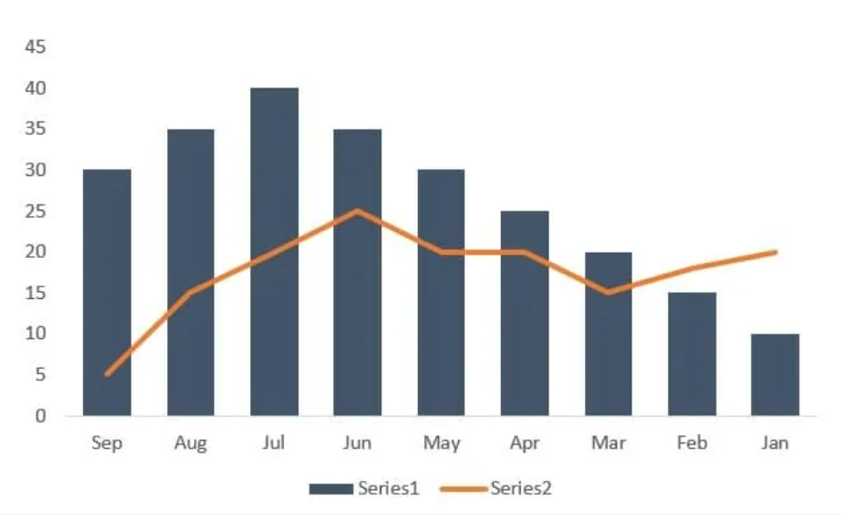
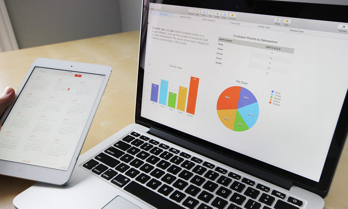
Attention to detail- Colours, sizes, shapes, labels and legends define the characteristics of the chart. The data behind runs the show but the characteristics appeases the users giving them the right information and the answers for which the Data viz dashboard is built.
The below snippet shows a clear distinction between the two measures- Series 1 and Series 2 due to its colour, type of graph and the legends used below.
5. “Where there is data smoke, there is business fire.” — Thomas Redman
Once you are able to convert data into information, the business questions can be answered, meaningful insights can be provided which helps management in better decision making to generate ROI and profit.
Conclusion:
There are numerous ways to visualize data. You must be interested in storytelling. A data creative can convert the boring data set to an appealing dashboard by creating attractive yet informational charts. So, are you a storyteller? If yes, data visualization is what you are looking for! Get started on it.


Get your data results fast and accelerate your business performance with the insights you need today.